
My contribution, among other things, is to be responsible for the design and communication of everything related to the foundation and the castle. One example is the Foundation's corporate identity.
The brand represents the building, as well the meaning of the castle's name, Castell-ter-çol, which translates to Castle-three-suns. The castle's also gives its name to the town, which has a heraldic shield with the same elements but a different design.
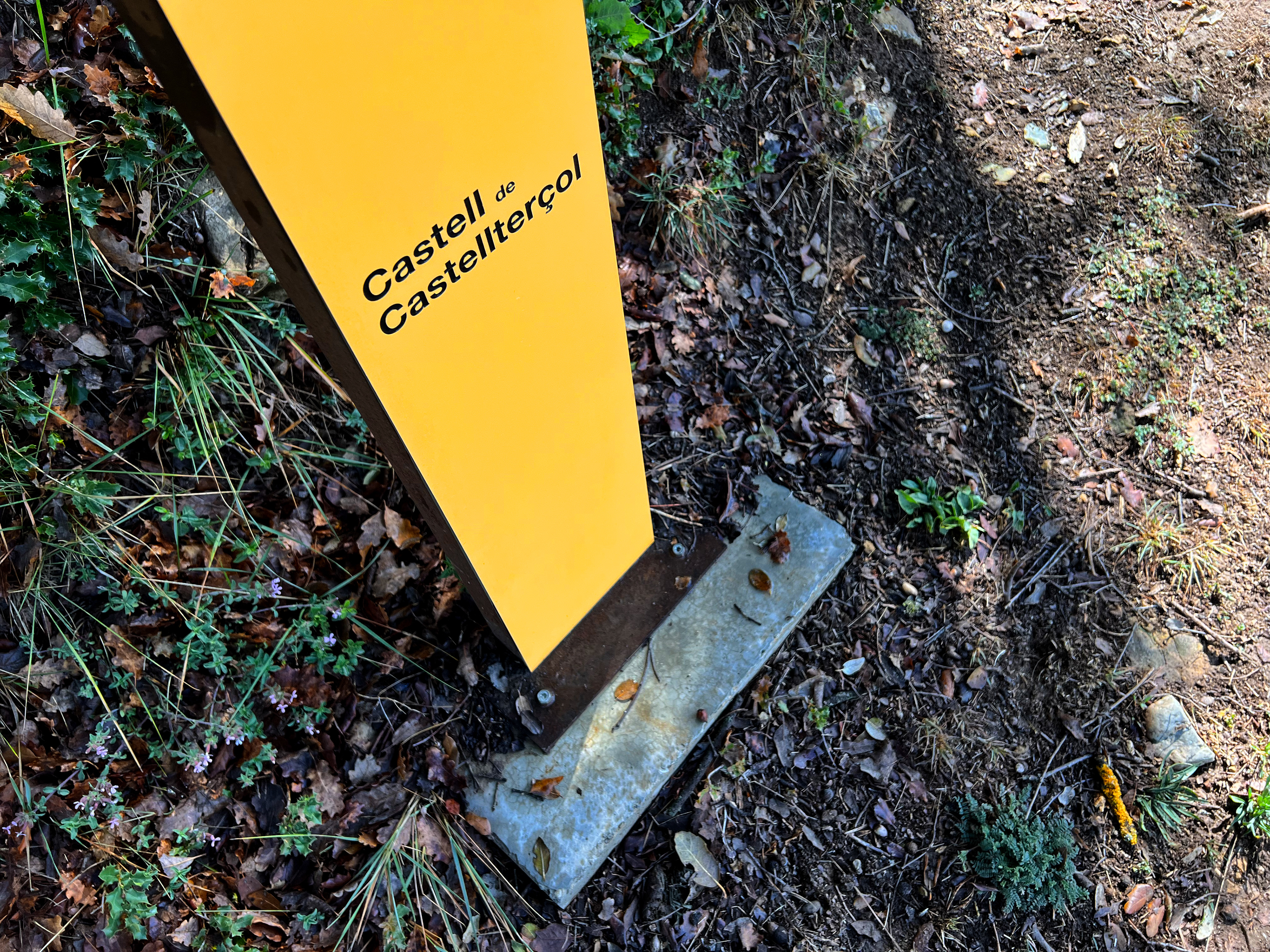
The primary colour chosen is yellow, which represents the three suns, in combination with black and white to highlight the foundation's relevance and sobriety, and by extension, the castle as an historic architectural monument.

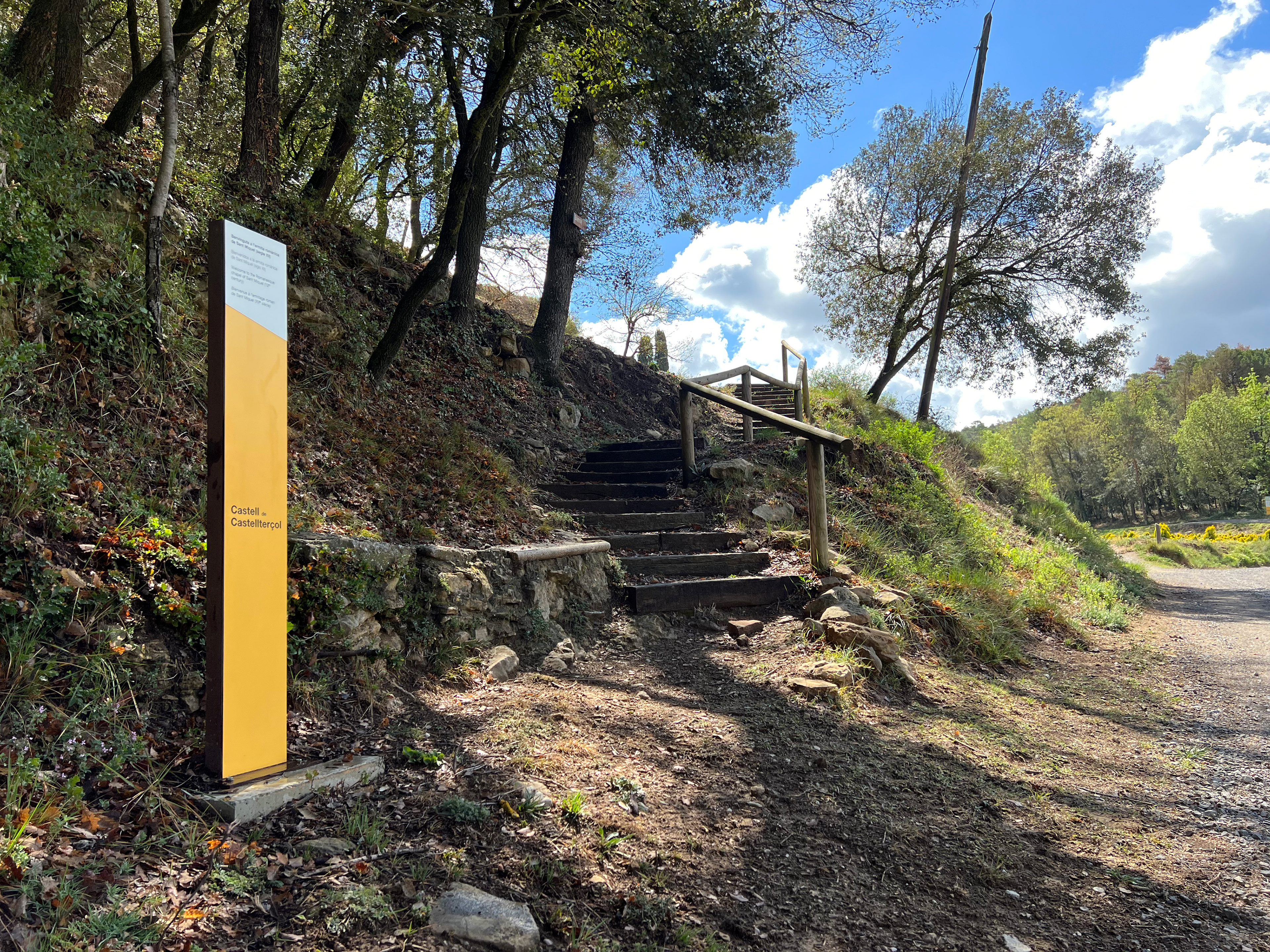
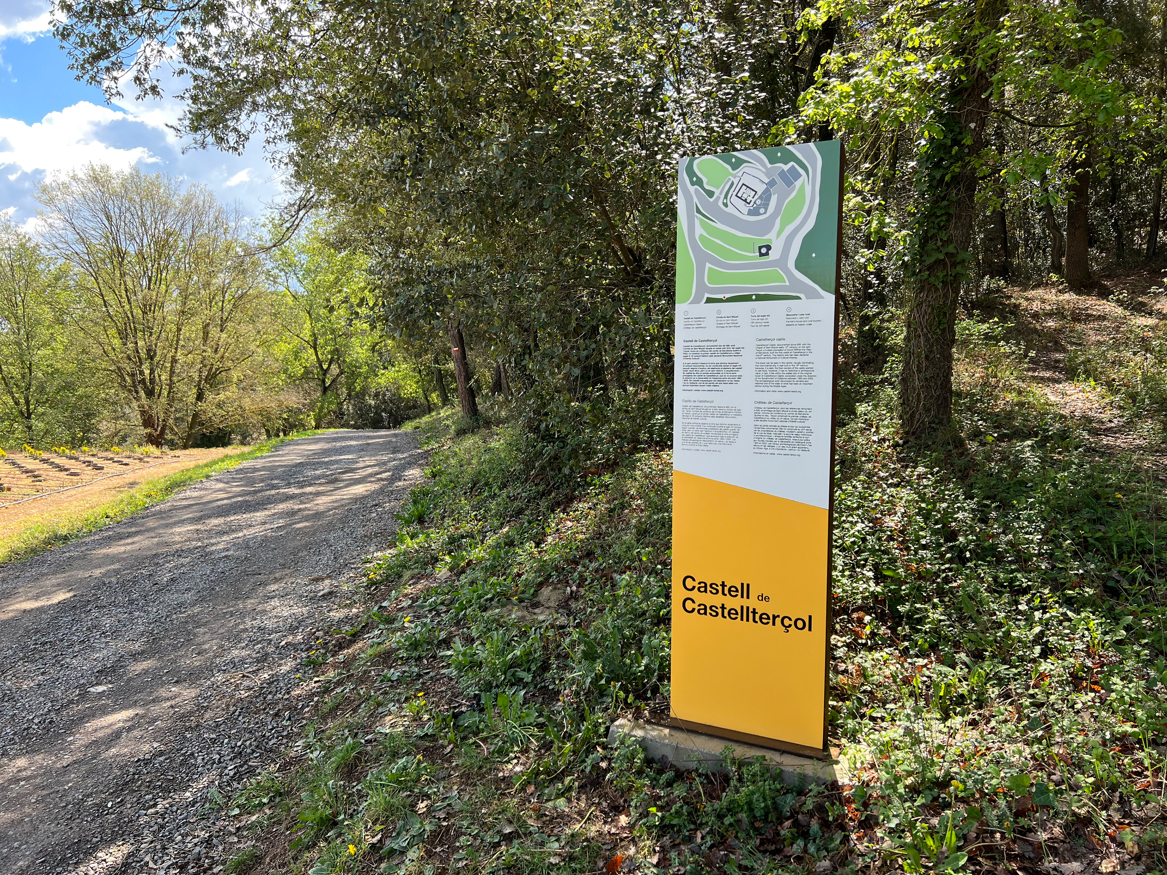
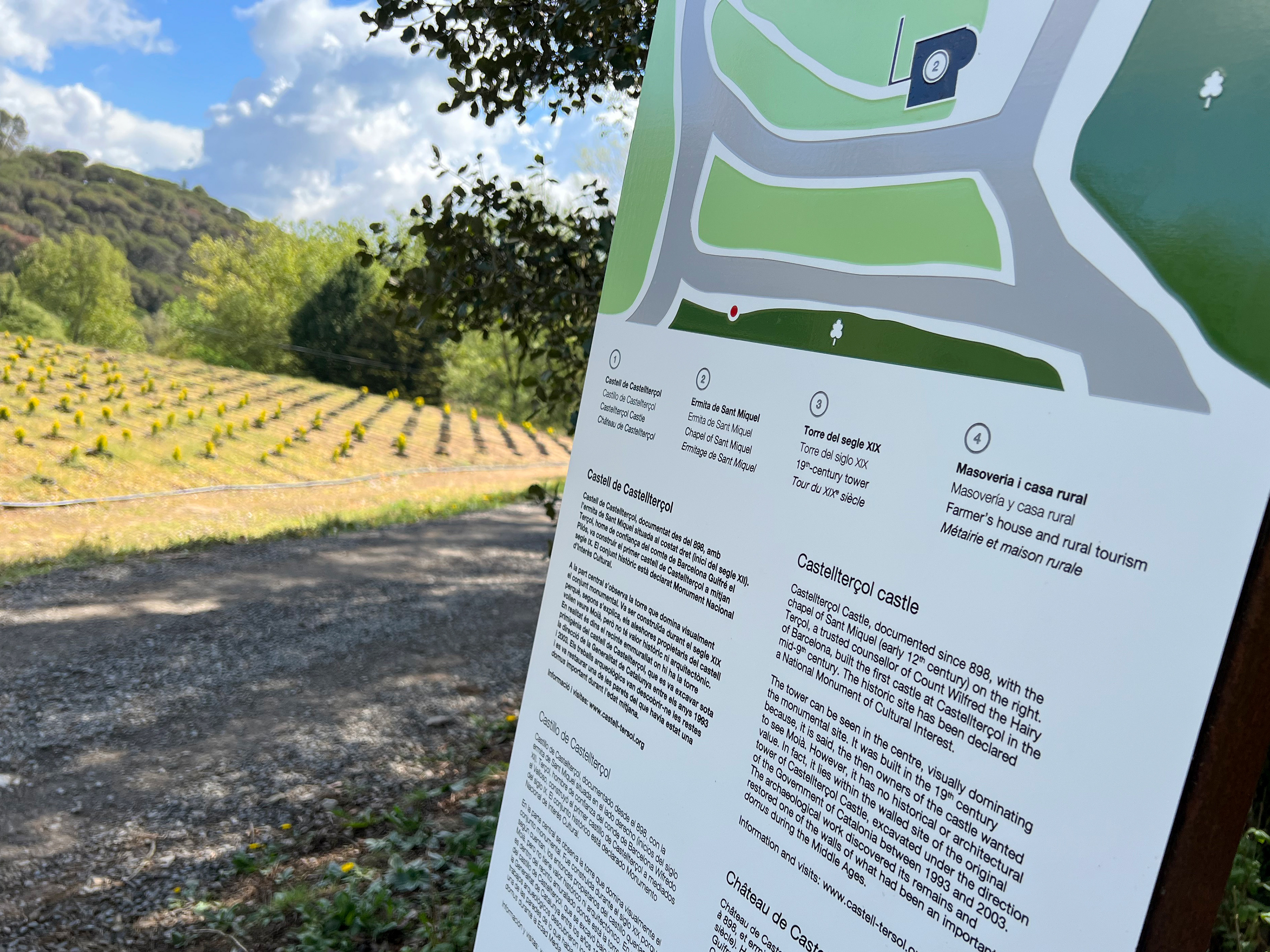
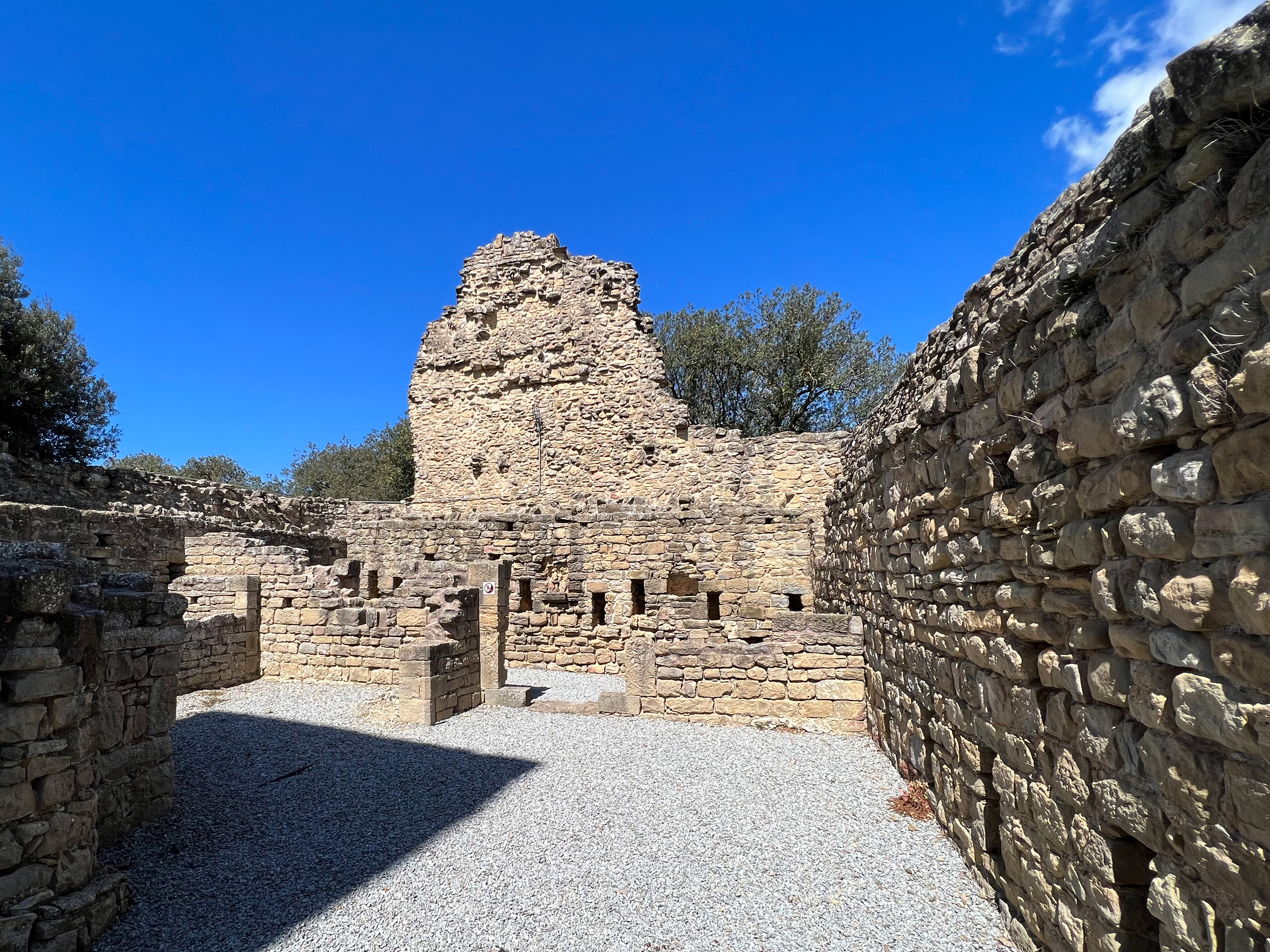
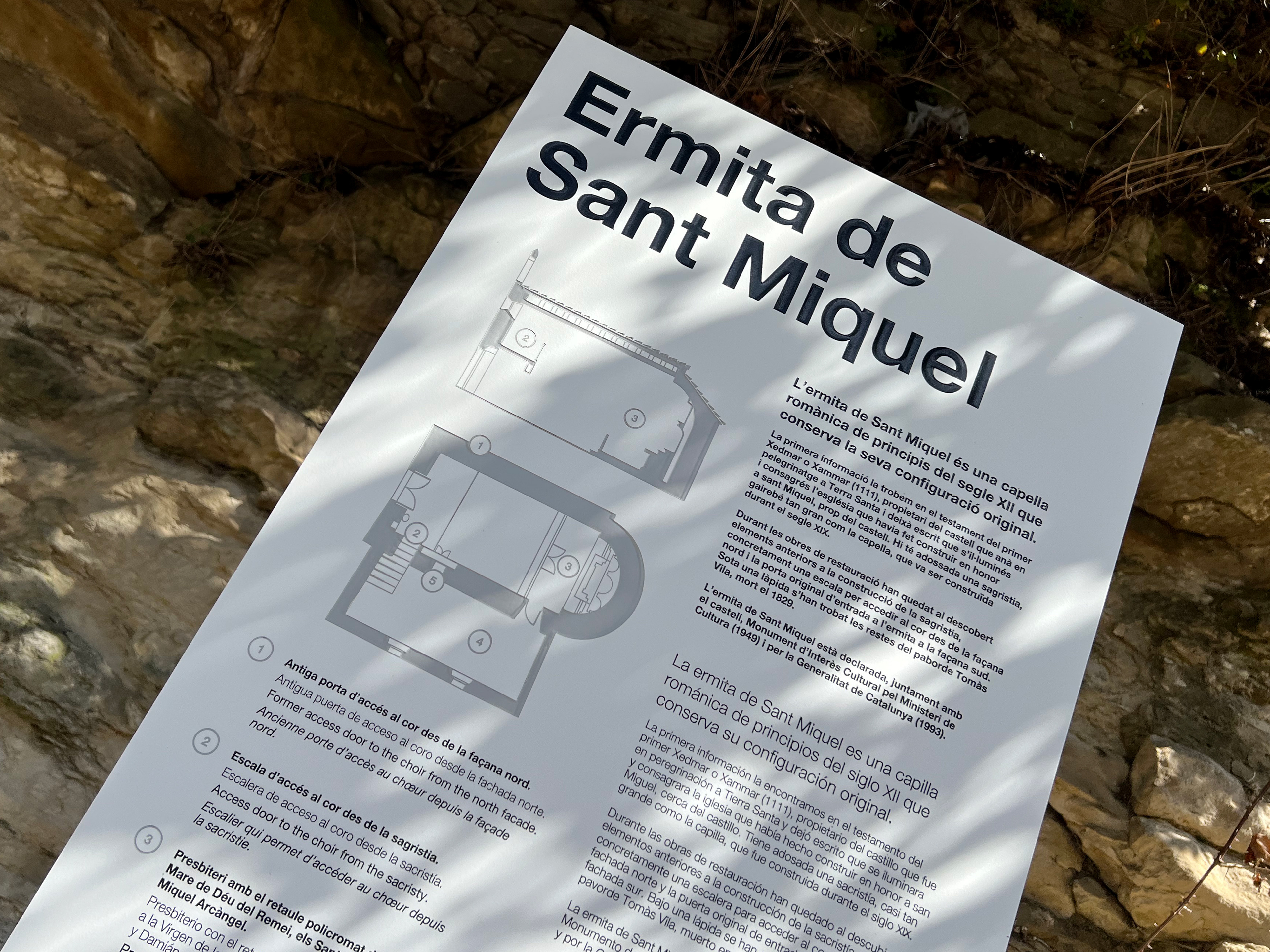
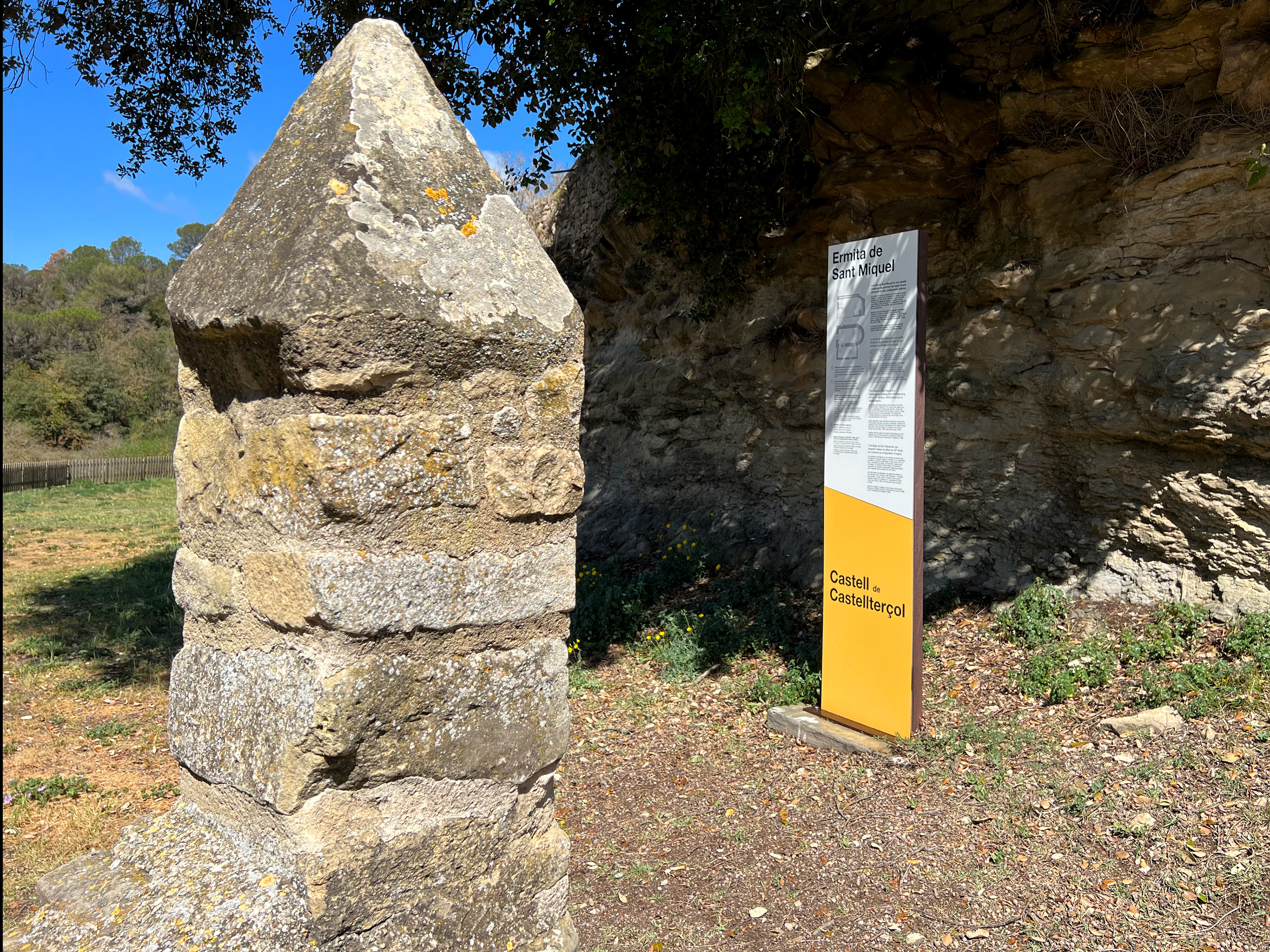
Another example of my work is the signage applied in the castle and its surroundings, to explain its history and some interesting facts at the visitable parts.


"Ad populum. De parvis grandis acervus erit"
